Because actually that wasn't very necessarily correct and the photos didn't look like the Pictorialism style.
But give me one more chance, please.
Okay, thanks!
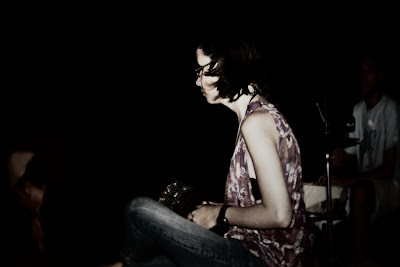
I had already edited one of the photos with Photoshop, the colors and the curves, but just a little bit:
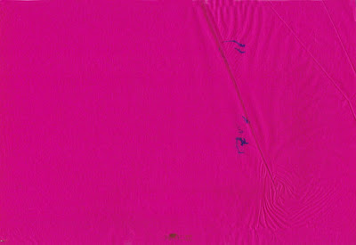
 Now I'll create a sandwich with this photo and a layer, which I've just used to edit these pictures. The layer is actually an old blotting paper, which I scanned:
 You can use many things as layer, for example photos of structures, different types of paper, etc., follow your creativity, but please NOT USE MY LAYER! ;)
Of course you must try as it works best, for example modify the opacity, change the layer settings (normal, multiply, overlay, etc.), color or b/w etc.
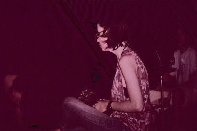
At the end it could look like this:
 Still not really the Pictorialism style?

No comments:
Post a Comment